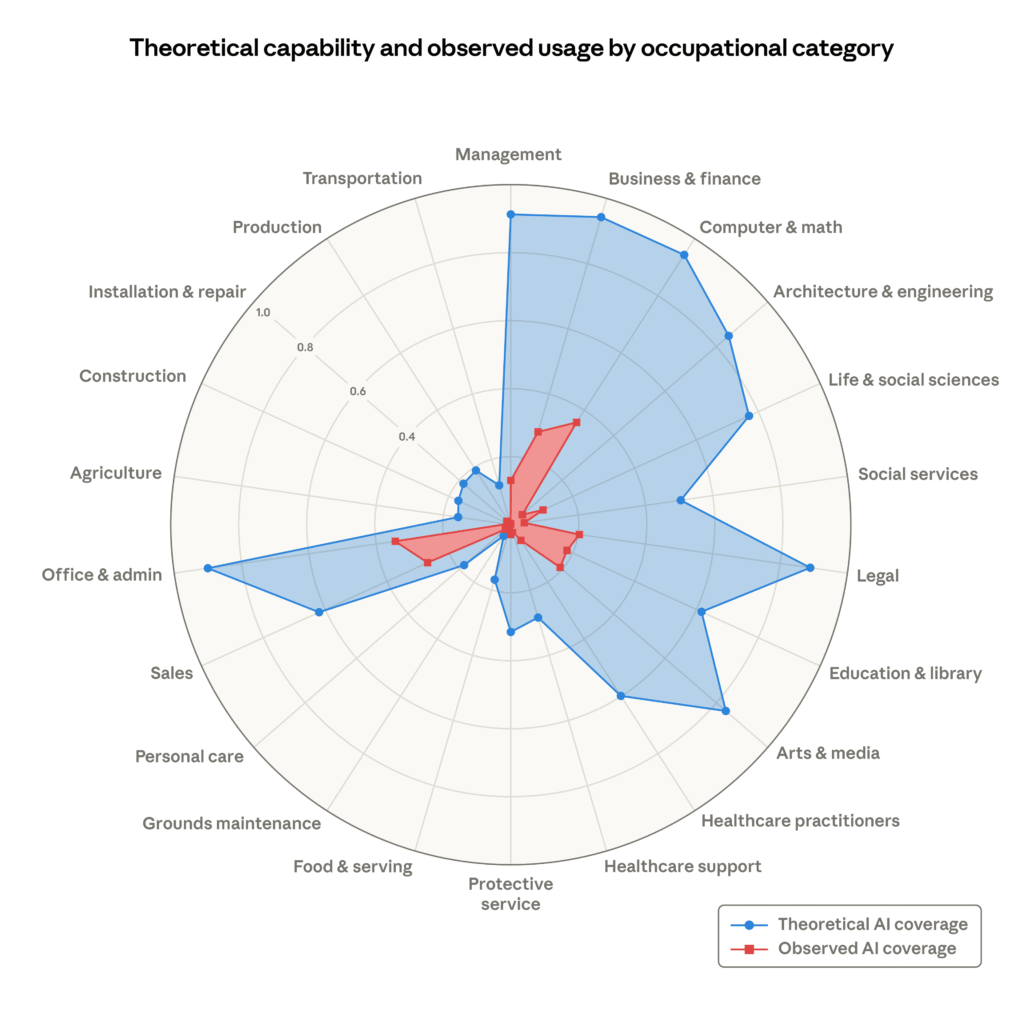
You’ve probably seen that chart floating around this month. The one from Anthropic’s labor market report, with the red area showing what AI is currently doing in various occupations and the big blue blob showing what it could theoretically do. At first glance, it looks like AI is about to swallow the entire U.S. job market whole.
That blue “theoretical capability” area covers at least 80 percent of individual job tasks in categories ranging from Arts & Media to Office & Admin, Legal, Business & Finance, and even Management. It’s a striking visual. I’ve seen it shared in a dozen Slack channels with varying degrees of panic attached.
But here’s the thing: that blue area is not a prediction. It’s not even a projection based on observed AI performance. It’s a collection of educated guesses, some of which are already outdated.
What the chart actually measures
Anthropic’s red “observed exposure” data comes from real usage patterns on Claude, their own LLM. That part is reasonably grounded. It shows where people are actually using AI tools today, and it’s pretty concentrated in software development, writing, and analytical support roles.
The blue area, though? That comes from a separate exercise where researchers asked: “If we assume future LLMs can handle any task that doesn’t require physical presence or specialized hardware, what fraction of tasks would that cover?”
That’s a massive assumption. It essentially defines theoretical capability as “anything a remote human worker could do with a computer and internet connection.” Which is a lot of things, sure, but it’s also a definition that deliberately excludes physical manipulation, in-person interaction, and tasks requiring real-world sensors or actuators.
The gap between theory and practice
I’ve been watching AI capability assessments for years, and there’s a persistent pattern: theoretical capability estimates always look terrifying, while actual deployment always looks more modest. The reasons are boring but important.
First, “theoretical capability” doesn’t account for reliability. An LLM can generate a legal document, but can it do so without hallucinating case law? Not consistently. It can write code, but can it debug a production system without introducing new bugs? Not really.
Second, it doesn’t account for integration costs. Even if an AI can technically perform a task, the cost of building the pipeline, validating outputs, handling edge cases, and maintaining the system often exceeds the value of the automation. I’ve seen plenty of projects that looked great on paper but died in pilot.
Third, there’s the human factor. Adoption isn’t just about capability. It’s about trust, liability, regulatory compliance, and organizational inertia. A task that’s technically automatable might stay human-performed for years because nobody wants to be the one who signs off on an AI making hiring decisions or medical diagnoses.
Where the chart gets it right
To be fair to Anthropic, they’re not claiming the blue area represents imminent job displacement. The chart is meant to contrast current observed usage (red) with an upper bound on potential future usage (blue). The gap between the two is where the interesting work happens: understanding why AI isn’t being used for those tasks yet.
The answer, in most cases, is that the tasks are harder than they look. “Theoretical capability” captures what an AI could do in isolation. But jobs are not isolated tasks. They’re interconnected workflows with feedback loops, exception handling, and context that isn’t captured in a prompt.
What this means for workers
I don’t think this chart should trigger panic. What it should trigger is a more nuanced conversation about where AI actually adds value versus where it’s being oversold.
The jobs most at risk are not the ones with high theoretical AI coverage. They’re the ones where the tasks are already standardized, digitized, and low-stakes enough that a 90% accurate system is good enough. Think data entry, basic customer support triage, and certain types of content generation.
The jobs safest from AI disruption are not the high-skill ones either. They’re the ones that require physical presence, interpersonal trust, or handling of edge cases that AI systems can’t yet handle reliably. Plumbers, nurses, and small business owners who build personal relationships with clients aren’t going anywhere.
The bottom line
Anthropic’s chart is useful as a thought experiment. It shows how much of the economy could theoretically be touched by AI if we ignore all the practical constraints. But that’s a big if. The blue area is not a prediction. It’s a boundary condition.
I’d rather look at the red area. That’s where the real story is: a modest but growing slice of the economy where AI is actually proving useful. The gap between red and blue is not a measure of impending disruption. It’s a measure of how much work remains to make AI actually practical.
Comments (0)
Login Log in to comment.
Be the first to comment!